Tweaking axis-labels of barplots (ggplot2::geom_bar)
I’d come across a question on StackOverflow, which requested to improve the following barplot by grouping 5 states together as an x-axis label e.g. "Alaska - California", "Colorado - Florida", ... (and so on).
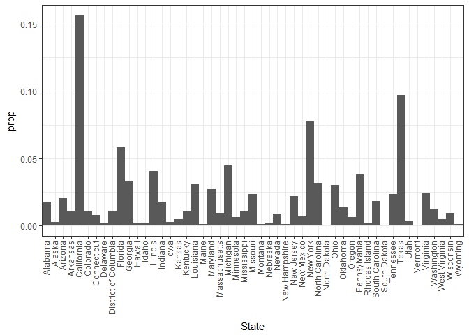
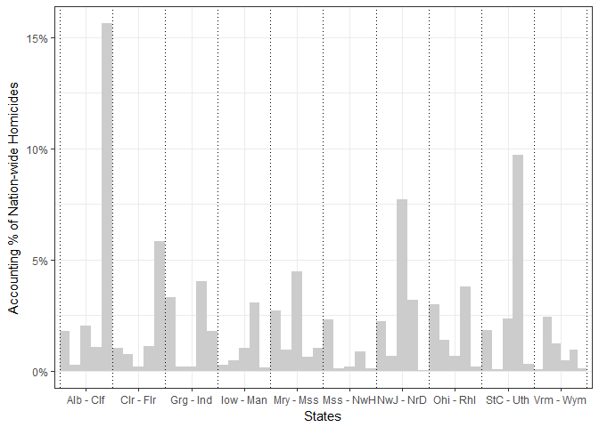
The barplot depicts the percentage of nationawide homicide occurences against States. Data source: Homicide Reports, 1980-2014
Even though the request of grouping states sounded quite easy, to come out with a generic solution applicable to any barplot was quite challenging.
The solution I come out with includes plotting based on a new grouping variable to group five states with abbreviate labels, e.g.`"Alaska - California".
(i) Housekeeping stuff:
# packages:
lapply(c("plyr", "dplyr", "tidyr", "ggplot2"), require, character.only = T)

# input data
file <- "https://raw.githubusercontent.com/minerva79/woodpecker/master/data/homicide_by_state.txt"
df <- read.table(file, sep="\t", header=T)
(ii) Determine the first and last element for each grouping of 5 states:
hd <- seq(1, nrow(df), by=5) %>% ceiling # first element
hd <- hd[-length(hd)] # remove last number, which represented nrow(freq)

td <- c((hd-1)[-1], nrow(df)) # last element
(iii) Create two functions to create the custom label for each group based on first and last element of each group (e.g. Alabm - Clfrn); and to find length of each group
abbrevFn <- function(head, tail, state, ...) paste(abbreviate(state[c(head,tail)], ...), collapse = " - ")
intervalFn <- function(head, tail) diff(c(head, tail)) + 1
(iv) Create new grouping by replicating custom labels for each group:
labels <- mapply(function(x,y) abbrevFn(x,y, state=df$State, min=15), hd, td)
labels.n <- mapply(function(x, y) intervalFn(x, y), hd, td)
df$group <- mapply(function(x,y) rep(x,y), labels, labels.n) %>% unlist

head(df)
##        State  Freq        prop                group
## 1    Alabama 11376 0.017818042 Alabama - California
## 2     Alaska  1617 0.002532681 Alabama - California
## 3    Arizona 12871 0.020159636 Alabama - California
## 4   Arkansas  6947 0.010880972 Alabama - California
## 5 California 99783 0.156288472 Alabama - California
## 6   Colorado  6593 0.010326507   Colorado - Florida
(v) Plot barplot based on the customised group, and dodge position by state:
xint <- c((1:length(hd) - .5), (1:length(hd) + .5)) %>% unique # set xintercept values for demarcate the groups

ggplot(df, aes(group, prop, fill=State)) +
    geom_bar(stat="identity", position="dodge", width=1) +
    scale_fill_manual(values=rep("gray80", nrow(df)))
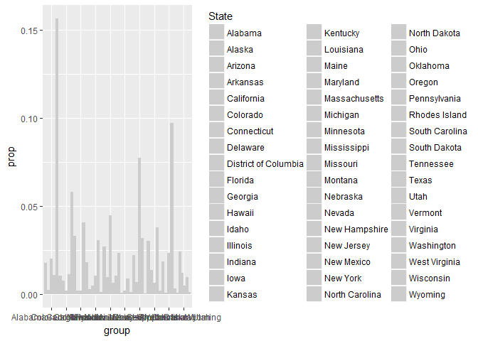
The labels in this case make the axis looks tremendously messy and the legend is taking out too much space. One quick fix is to change the label length, with the min.length argument in abbrevFn, and plot without legend
labels <- mapply(function(x,y) abbrevFn(x,y, state=df$State, min=3), hd, td)
labels.n <- mapply(function(x, y) intervalFn(x, y), hd, td)
df$group <- mapply(function(x,y) rep(x,y), labels, labels.n) %>% unlist

(p <- ggplot(df, aes(group, prop, fill=State)) +
       geom_bar(stat="identity", position="dodge", width=1) +
       scale_fill_manual(values=rep("gray80", nrow(df))) +
       guides(fill=FALSE))
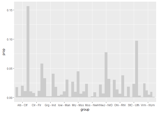
Let’s tidy this plot with appropriate labels, showing percentage instead of proportion and some guidelines for each group
p + ylab("Accounting % of Nation-wide Homicides") +
  xlab("States") +
  scale_y_continuous(labels=scales::percent) +
  guides(fill=FALSE) +
  theme_bw() +
  geom_vline(xintercept=xint, linetype="dotted")
Another example:
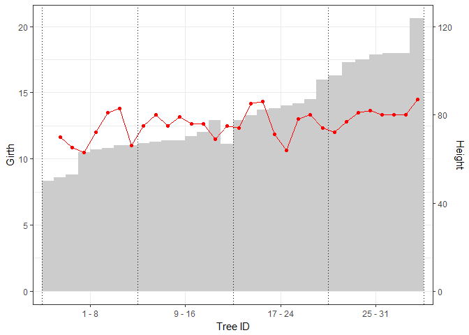
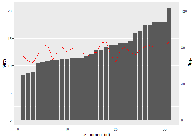
So let’s apply similar coding on another data-set trees. The following is a dual-axis plot of Tree ID against Girth and Height:
dat <- trees %>% mutate(id = rownames(.))
ggplot(dat, aes(x=as.numeric(id), y=Girth)) +
  geom_bar(stat="identity") +
  geom_line(aes(y=Height/6), colour="red") +
  scale_y_continuous(sec.axis = sec_axis(~.*6, name = "Height"))
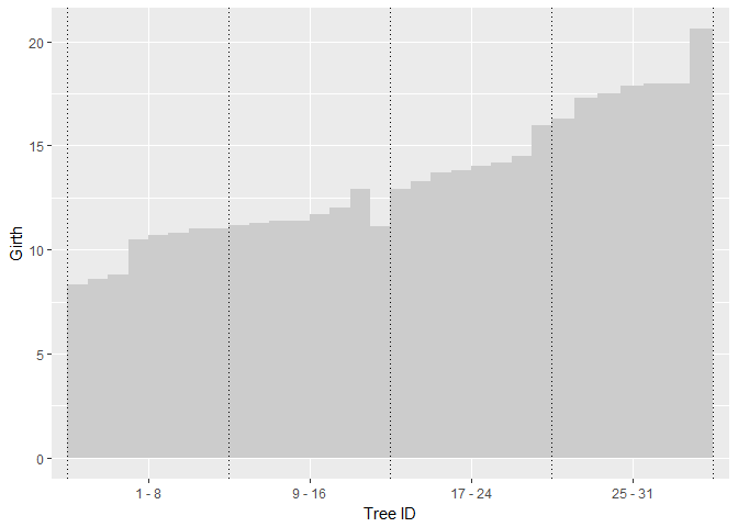
Instead of dividing up the groups manually into vectors of first and last element, the grouping can be done in a list using split function as such:
grouping <- dat$id %>% split(., ceiling(seq_along(.)/8))

labels <- lapply(grouping, function(ii) mapply(function(x,y) paste(x, y, sep=" - "), ii[1], ii[length(ii)]))
labels.n <- lapply(grouping, length)

dat$gp <- mapply(function(x,y) rep(x,y), labels, labels.n) %>% unlist
dat$gp <- factor(dat$gp, levels=unlist(labels))
Plotting out the barplot element is similar to the previous example:
p <- ggplot() +
  geom_bar(data=dat, aes(x=gp, y=Girth, fill=id), stat="identity", position="dodge", width=1) +
  scale_fill_manual(values=rep("gray80", nrow(dat))) +
  xlab("Tree ID") +
  guides(fill=FALSE)

xint <- seq(.5, 4.5, 1)
(p <- p + geom_vline(xintercept=xint, linetype="dotted"))
Plotting the line as a second axis in this case require a bit of manual tweaking:
dat$nx <- (seq(.5, 4.5, by=.125) + .125/2) %>% .[c(-1, -length(.))]

p +  geom_line(data=dat, aes(x=nx, y=Height/6), colour="red") +
  geom_point(data=dat, aes(x=nx, y=Height/6), colour="red") +
  scale_y_continuous(sec.axis = sec_axis(~.*6, name = "Height")) +
  theme_bw()